ShopDreamUp AI ArtDreamUp

Deviation Actions


Description
As promised heres the finished product. i removed the black lettering and made a couple small changes to it. but nathing to major.
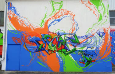
thought it would be fun to do a sketch with the 4 main styles i've used in the past 5 or so years now. the bottom being the oldest going up to the top being the current.
i started doing the 3D style (bottom) back around mid 2008 i believe. i might just add a picture of my first 3D wall just to show you how far the styles come haha.
around the end of 2009 i started trying out an organic type style (middle bottom). this one tends to give me the most trouble on walls. it involves a lot of skinnier lines and trying to get the shading within them is a real bitch for me. for me its the most rewarding style to work with on the wall since it looks the best in comparison to anything i paint. gains the most attention too.
the next style isnt really newer than the others to be honest. its just a basic semi-wildstyle that i've kind of altered over the years taking influence from styles i experience with. started doing these around the same time as the 3D when i didnt feel like spending too much time on something. i usually end up making my 2d styles fairly symmetrical on accident. i dont even try and end up noticing once i look at the finished product. so i tried to remove that from this style as much as possible without making it look too awkward and unbalanced. even though it hardly works out that way. it has a bit of a funk feel compared to the rest in my opinion
the top style is the newest and only about 4 months old now but i started doing it while freestyling a piece on the wall. liked the way it looked and im still working on it but even though its not really showing yet i feel like its got a lot of potential to turn into a good wildstyle. its still fairly simple here but im working on getting it a bit more technical. my wildstyles i've done in the past arent wild enough for me so im hoping this one can get me there.
BY ALL MEANS PLEASE CRITIQUE THE FUCK OUT OF THE STYLES AND LET ME KNOW WHAT YOU THINK IS BEST. I get tons of comments saying "that shits dope" but if your already looking at it take 30 seconds and point out what you think looks good/bad or where the letter structure looks a bit odd so that i can go in and work on it the next time.
Image size
1536x2048px 1.98 MB
Make
LG Electronics
Model
Vortex
Focal Length
4 mm
Date Taken
Nov 26, 2012, 8:15:15 PM
© 2012 - 2024 Phews
Comments10
Join the community to add your comment. Already a deviant? Log In
This is cool,i think you should have illustrated other coloring techniques across each of them.To be honest i think the first or second is probably the best,the other two are definitely good and definitely skillful,but i think that simpler is better in this case,they are so intricate and detailed,that the whole is kind of hard to perceive at once,so as a whole the word is kinda of smear to the mind unless you get close,and ponder it's angles edges and dimensions.
Just another opinion from your run of the mill know nothing tagger! (Wink)")
Just another opinion from your run of the mill know nothing tagger!